Sunday 28 October 2012

Madness of Crowds Editorial

Editorial illustration intended for The New Statesman. Found this one of the most challenging briefs based on the text, but feel happy with the outcome. I know that editorials are designed to be printed small, but I cant help use a large file size- so my illustration is also suitable for other layouts. This is a much sharper/cleaner way of working than usual, but I would like to continue using this style for the next few editorial illustrations I produce. Once again Ive been using dots for texture which I feel works well.

In Context:

Saturday 27 October 2012

Pocky WIP

Inspired by a mix of different childrens tv programmes like Dexters Lab. and Frankensteins Cat, Ive begun colouring the advert. Ive found the colouring so far easier than expected, but having issues with the background. The whole ad will be done in a cartoon style apart from the box of pocky which will be digitally painted. Avoiding using 'halloween' colours.

Thursday 25 October 2012


Pocky advert final client visual and WIP on the line-art. It's taken me a long time and many compositions to come to this conclusion, which is now ready to develop further. I intend for the whole advert to be created digitally- once again switching software for each step.

Sunday 21 October 2012

An additional postcard style piece, which I prefer to the editorial work. This time using a mix of Artweaver/Sai Painter and Adobe Illustrator. I'd like to extend this to a range of postcards...though Im not sure what theme to follow yet.

Editorial Illustration for a Guardian Article. And again in context:

Tuesday 16 October 2012

This friday I'm off to London for the day to go and see 'The Art of Frankenweenie' Exhibition. I'm really looking forward to it, having seen some photos online. Although Im looking forward to the movie, I'm not getting my hopes too high; as I've not been impressed with Burton's latest films. The reviews seem positive so far which is a good sign. I'll be taking my sketchbook and camera with me; so I'll post some bits on here after. Anyone know of any other events/galleries in London worth checking out?

Saturday 13 October 2012

'Why Small Victories Matter' Editorial Illustration
A slightly harder editorial this week; with the idea smaller achievements are more fulfilling than a large one. After several attempts (and a lot of hours)I've decided this is the best design. My original designs were too bright and garish, so this has been toned down in order to be more appropriate. Although I am happy with the background, I'm not sure about the positioning of the darts. Any feedback is appreciated.

Thursday 11 October 2012

Wednesday 10 October 2012


Editorial Illustration for an article for The Guardian '
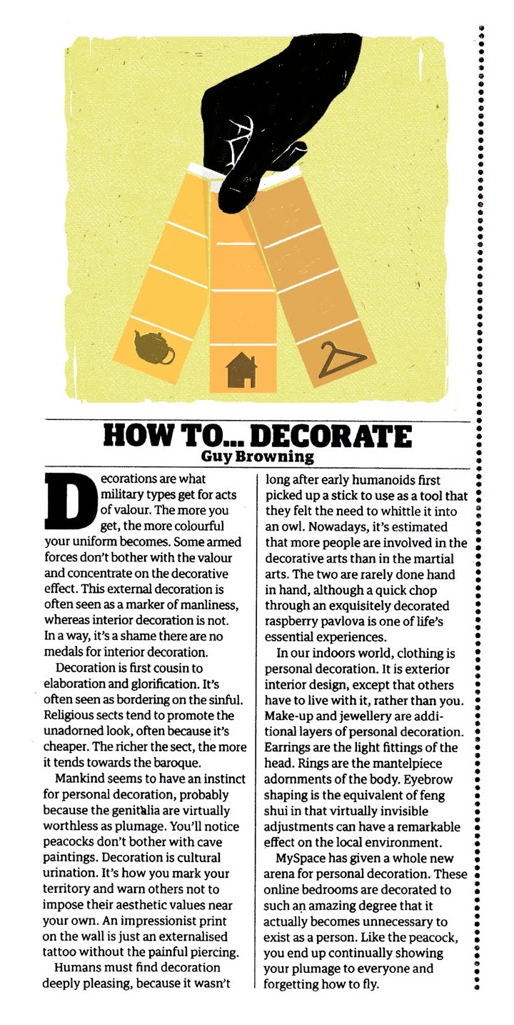
How to Decorate'. I decided to continue with the image of a hand holding colour swatches, with each colour swatch having an icon of something we decorate. After many different versions, the logos which had the most impact were; a house (for decorating inside), a coat hanger (representing clothes, and decorating ourselves) and a teapot (for decorating the most mundane of things). I think the simple colour scheme was more effective, and made the image look more complete than when it had different colours. The overall effect feels right; but think the icons still need more work, as something feels out of place.

(Work in Progress)


The decision to turn the illustration upside down (from the original design)greatly improved the design; perhaps because the image now reads top to bottom- with the boldest element (the hand) at the top.
The hand turned down almost suggests a disapproving of decoration- which in some ways, is what the article is about.

Friday 5 October 2012

Another day finishing off the Swedish Mouse.
Above is a sneak peak at one of the final pieces. I will upload the finished images once the competition has ended, along with thoughts on this project.